Event · Festival, Douala · 2026
The Summer Show
A festival site has to sell to two very different people at once: a nineteen year old deciding whether to enter, and a sponsor deciding whether this looks professional. This one gives each of them their own path and never makes them compete for the same screen.
Who this page has to convince
Two people, and they want opposite things.
The first is young, in Douala, on a phone, deciding whether to buy a pass or enter the competition. They want energy, they want to see people like them on the page, and they want to know the price in the first ten seconds.
The second is a sponsor or a brand manager reading on a laptop, deciding whether to put money behind it. They want evidence that this is organised: dates, venue, numbers, past editions, someone accountable.
Most event sites try to serve both with the same paragraph and end up convincing neither. Here the two are separated. The top of the page belongs entirely to the first audience. The sponsor material lives on its own page, in a calmer register, and is linked rather than mixed in.
What the colour is doing to the reader
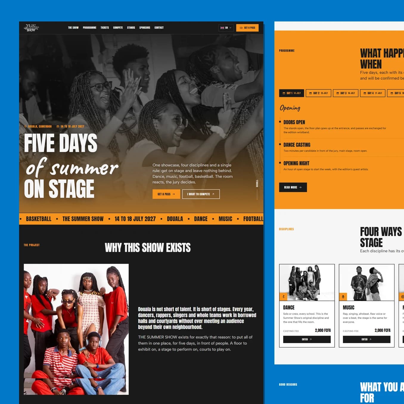
Orange, blue, near black and a warm off white, all taken straight from the client's brand book.
Orange is the engine. It is the colour of movement, appetite and urgency, and every button that costs money is orange. Blue does the opposite job: it slows the page down and reads as dependable, so it carries the practical sections where somebody needs to trust a detail. Black gives the whole thing weight and keeps four saturated colours from feeling like a children's party.
Almost every section changes ground colour. That is not decoration, it is pacing. A visitor scrolling fast can tell they have arrived somewhere new without reading a word, so the page feels navigable even at speed, which is how people actually read on a phone.
There is not one rounded corner on the site. Everything is a hard rectangle with a hard offset shadow and no blur, which is the visual language of printed posters and flyposting. It says street culture, and it says this event exists in the real world.
How the ticket flow closes the sale
Buying a pass is where event sites lose people. The form here shows the pass being built beside it as you fill it in: your name, your category and your day appear on the ticket in real time.
Watching the object take shape makes the purchase feel already half completed, and half completed things are very hard to abandon. It also removes the anxiety of not knowing what you are actually getting, which for a first time buyer is the real blocker rather than the price.
Guiding to the one action
Every section ends by pointing at one of two doors: get a pass, or compete. Never both in the same breath. The header carries the pass button on every screen and in both languages, so someone who decides on the programme page does not have to scroll back to act.
French is the default because the audience, the city and everything the team has ever posted is French. English exists for the diaspora and for sponsors who read in English, and it is a full translation rather than an afterthought, because a half translated page tells an international sponsor exactly how seriously to take you.
Best seen running.
Scroll it on a phone as well as a laptop. A lot of what makes this build work only shows up while it is moving.