Agency · Social media marketing · 2026
Smay
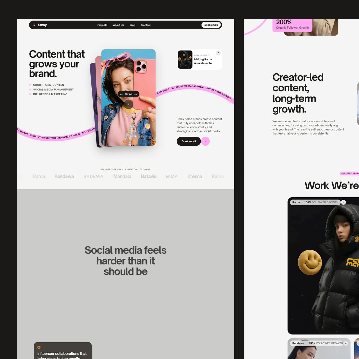
Most agency sites open by talking about themselves. This one opens by naming the exact frustration the visitor arrived with, and only starts selling once the reader has already agreed with it.
Who this page has to convince
A brand owner or marketing manager who has already tried this. They have paid creators, they got views, and they cannot point to a single sale that came from it. They are sceptical, slightly embarrassed about the money they already spent, and they have read a dozen agency pages that all promised the same things.
You cannot open that conversation with "we are a creative agency". So the page does not. A few screens in, it stops and says plainly that social media feels harder than it should be, then lists the specific ways it goes wrong: collaborations that bring views but no results, posting constantly with nothing to show, never knowing what is actually working.
Naming somebody's problem better than they can name it themselves is the fastest way to earn the right to sell to them. Everything after that point is read differently, because the visitor has already silently agreed with you once.
What the colour is doing to the reader
Four flat pastels, pink, purple, orange and green, on a warm near black.
The pastels signal that this agency lives in creator culture and understands the internet the client's customers are actually on. The black under them is what stops that from reading as unserious. Together they say: we know this world, and we are still a business you can send an invoice to.
There is no gradient anywhere on the page, no glass, no coloured shadow. Everything is flat fills and hard blocks. That restraint is why the pastels can be so saturated without the page feeling cheap, and it keeps the eye moving instead of stopping to admire effects.
The whole site uses one heading size. Nothing ever gets bigger for emphasis. When a section needs to shout, the background changes colour instead. The effect is that the reading order is never ambiguous, and the visitor never has to work out what is more important than what.
How the page builds belief
The order is deliberate: problem, then results, then how, then who, then price.
Real work appears before any description of the services, because a sceptical buyer trusts evidence far earlier than they trust explanation. Named brands, follower growth figures and the actual content sit up front. The four service panels come afterwards, stacking one over another as you scroll so each gets the full screen and none of them can be skimmed past accidentally.
Then a direct comparison of working with them against carrying on alone, then the team's faces, because people buy from people. Pricing is on the page rather than behind an enquiry, which removes the last reason to stall.
Guiding to the one action
One action, everywhere: book a call. Same words, same pill shaped button, in the header, after the problem, after the results, after pricing and in the footer.
By the time a reader has gone from "that is exactly my problem" to "they have done this for brands like mine" to "I know what it costs", the button is not an interruption. It is the obvious next thing to do, and it is already under their thumb.
Best seen running.
Scroll it on a phone as well as a laptop. A lot of what makes this build work only shows up while it is moving.