Education · Early-years childcare · 2026
Gloobies
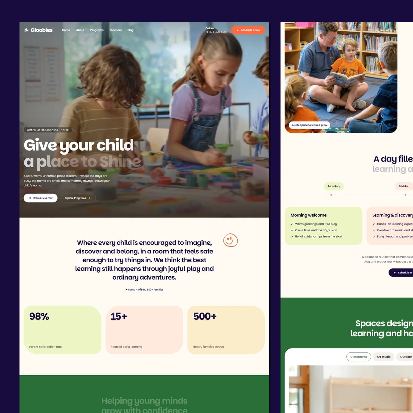
A parent choosing a nursery is making an emotional decision and looking for permission to feel safe about it. This site leads with a video of children who are visibly happy, then answers every practical worry before asking for anything.
Who this page has to convince
A parent, most often a mother, comparing three nurseries at eleven at night with the baby finally asleep. She is tired, she is anxious, and she is about to hand over the person she cares about most in the world to strangers.
She is not shopping. She is looking for permission to stop worrying. The site's job is to give her a reason to feel calm, then remove every practical objection before she has to ask.
Why the hero is a video
The same room photographed as a still makes a noticeably colder page. Children moving, playing and laughing is the entire argument a nursery is making, and no paragraph replaces it.
Within two seconds of landing, a parent has seen other people's children happy in that room. That is an emotional answer to an emotional question, and it happens before a single word of copy has to work.
Immediately underneath sit the numbers: satisfaction, years running, families served. That order matters. Feeling comes first because feeling is what she came for, and evidence comes second because evidence is what lets her justify the feeling to herself and to her partner.
What the colour and type are doing to the reader
Cream, four soft pastels and one warm orange. Nothing on the page is stark white and nothing is clinical blue, because clinical is the exact wrong note. Warm creams read as home rather than institution, and the pastels rotate in a fixed order so no two cards ever fight each other.
One typeface does the whole site, chosen for its round, slightly soft letterforms. It is most of the reason the page reads as a nursery instead of a clinic, and it makes even the terms and conditions feel approachable.
Body copy is small on very generous line spacing. Open, airy text reads as unhurried, and an unhurried page is what a tired person at midnight can actually take in. Every element has room to breathe, which quietly signals a place that is not overcrowded.
Orange carries every action. It is the only saturated colour on the page, so it never has to compete for attention.
How the page removes objections
After the feeling and the proof, the page works through what a parent actually needs to know: what happens in a day, hour by hour, what the rooms look like, what other parents say, and then a run of frequently asked questions written as answers rather than as marketing.
The rooms are grouped by age, and the whole card is clickable rather than only a small link, because making somebody hunt for the right few pixels is a friction you can simply delete.
Guiding to the one action
Schedule a tour. Not enrol, not call us, not request a brochure.
A tour is a low commitment step that fits how this decision is really made, and it moves the conversation to the place where nurseries win, which is the building itself. The button sits in the header on every screen, at the end of the hero, after the daily routine, after the testimonials and in the footer, always in the same orange and always with the same words.
Best seen running.
Scroll it on a phone as well as a laptop. A lot of what makes this build work only shows up while it is moving.