Creative studio · Portfolio · 2025
Studio
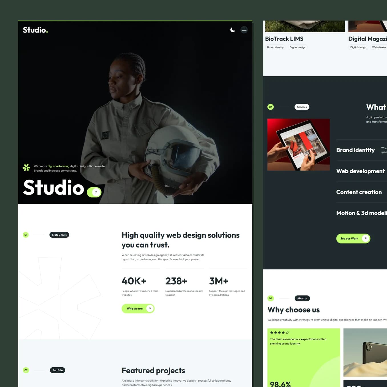
A creative portfolio is judged in about four seconds, and it is judged on the work rather than the writing. This one gives every project the full width of the screen and organises the page as numbered chapters so a busy reader always knows where they are.
Who this page has to convince
A marketing director or founder building a shortlist. They have five tabs open, they will spend under a minute on each, and they are looking for a reason to close yours.
They do not read. They scan for work that looks like the standard they want, then they look for signals that this is a real company with real clients. Only if both survive do they read anything.
How the page is organised for a scanner
Every section is numbered, like chapters in a document. 02 Portfolio, 04 About us, 05 Testimonial, 06 The team. It sounds like a small thing and it changes the feel completely: a numbered page reads as considered and methodical, which is exactly the impression a studio wants to give somebody about to hand over a budget.
It also means a reader always knows where they are and roughly how much is left. Knowing the shape of a page is what stops people bailing out of a long one.
Work comes first and gets the full width of the screen with almost no commentary next to it. Copy is short and set to the side. If the pictures cannot carry it, more words will not save it.
What the colour is doing to the reader
The page moves between light and dark rather than committing to one. Practically, that gives every project image two different grounds to sit against, so a long scroll never flattens out and each piece of work gets a fresh backdrop.
Psychologically, the dark sections are where the claims live: expertise, scale, reach. Dark grounds read as authority and make numbers feel weightier. The light sections carry the human material, the team and the process, where approachability matters more than gravity.
Where the proof is placed
Testimonials and figures are not clustered in one block near the bottom. They sit at the exact points where a sceptical reader starts to doubt: right after the work, right after the claim about global reach, right before the price.
Objection handling works best next to the objection. A wall of logos at the end of a page is read by nobody who was already leaving.
Guiding to the one action
Get in touch, and nothing else competes with it. No newsletter, no downloads, no second button pulling attention sideways. The form is short, the tone is conversational rather than corporate, and it is reachable from the top of every screen for the reader who decided on the second project and does not want to scroll to the end.
Best seen running.
Scroll it on a phone as well as a laptop. A lot of what makes this build work only shows up while it is moving.