Studio · Short-form video editing · 2026
Clipper
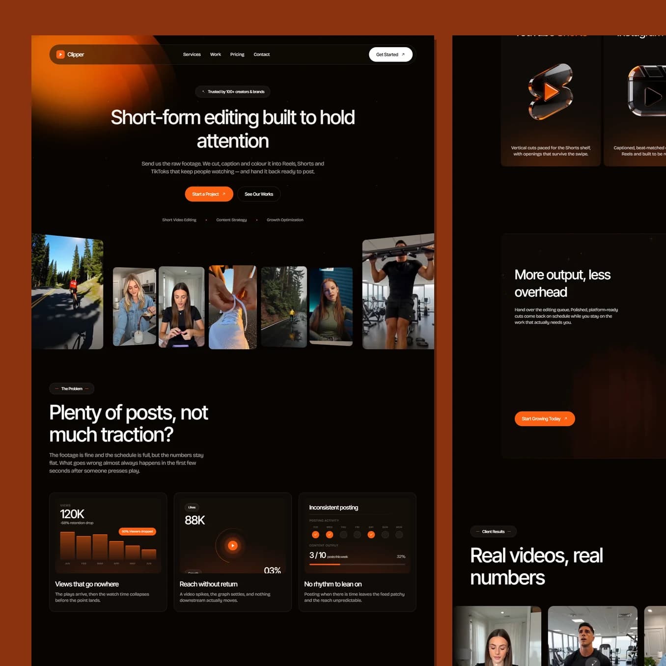
Creators do not buy editing, they buy the hours back and the views they are not getting. This site names that gap in the first screen, proves it with real numbers, and keeps the whole page dark so the work itself is the only bright thing on it.
Who this page has to convince
A creator or a brand's social lead who is already posting. The footage exists, the schedule is full, and the numbers are flat. They are not shopping for an editor. They are trying to work out why the effort is not turning into reach, and quietly wondering whether the problem is them.
That is why the page does not open with services. It opens by naming the gap: plenty of posts, not much traction. Then it is specific about where it actually goes wrong, which is the first few seconds after somebody presses play.
Being specific is the whole move. Anyone can say they edit short-form video. Saying exactly where a video loses people proves you have watched the analytics rather than just the footage, and that is the moment a sceptical creator starts reading properly.
What the colour is doing to the reader
The ground is a warm black rather than a neutral one, and one hot orange does everything else.
Warm black is the room a video gets watched in. It is the colour of an editing suite, a cinema and every player interface the audience already knows, so the page feels like the environment the work lives in instead of a brochure about it. It also does something practical: a dark page makes video thumbnails glow. Every clip on the site is the brightest thing on its screen, which is exactly the right hierarchy for a studio whose argument is the work.
The orange is warmth and momentum, and it only ever appears on things you can act on: buttons, active states, the counters. Because it is never used decoratively, the eye learns within a few seconds that orange means "this is where you press".
There is no bold weight anywhere and no pure grey. Secondary text is white at an opacity, so it picks up the warmth of the ground rather than sitting on top of it as a flat slab. It is a small decision that keeps a very dark page from feeling cold and dead.
How the page turns doubt into confidence
The order is deliberate. Problem, then proof, then service, then price.
Straight after the problem come the numbers: retention, output, turnaround. Then real videos, full width, playing. A creator judges an editor by watching, not by reading, so the showcase is given room rather than being tucked into a grid at the bottom.
Only then does the page explain how it works, and it explains it as a handoff rather than a process: send the raw footage, get back cuts that are ready to post. That framing matters more than any feature list, because what the visitor actually wants is the editing queue off their desk.
Pricing is on the page. For a creator deciding between hiring a freelancer, doing it themselves at midnight, or a studio, a hidden price is a reason to keep scrolling somewhere else.
Guiding to the one action
Start a project, and it is the only orange button on any screen. It sits in the header, at the end of the hero, after the results, after the process and after pricing.
There is a quieter second option next to it in the hero, see the work, for the visitor who is not ready. That pairing matters: giving a sceptical reader somewhere legitimate to go keeps them on the site instead of closing the tab, and the showcase they land on is the page most likely to sell them anyway.
Best seen running.
Scroll it on a phone as well as a laptop. A lot of what makes this build work only shows up while it is moving.