Shopfront · Personal care · 2026
Essentials by Dee
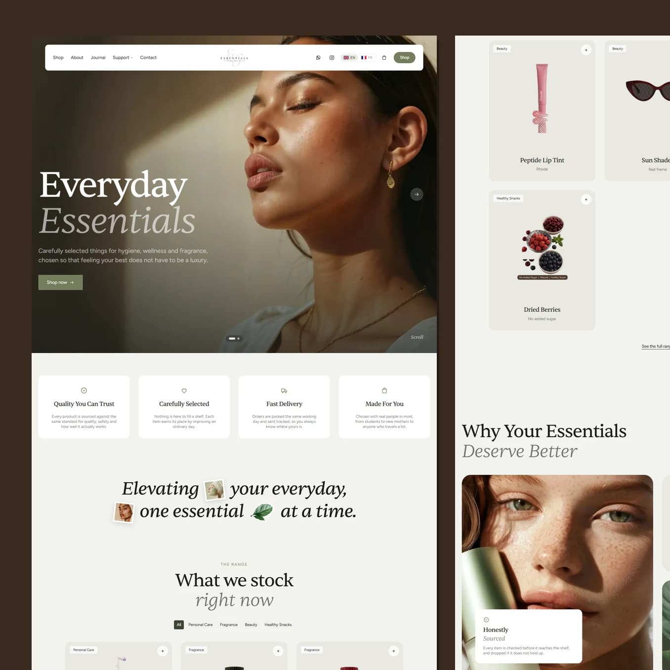
People buying skincare from a brand they have never heard of are really asking one question: is this real. The whole shop is built to answer it, with two photographs of every product, a palette taken from the brand’s own packaging, and prices shown before anyone has to click.
Who this page has to convince
Somebody who found the brand through a friend or a post, likes the look of it, and is now deciding whether to trust a small independent shop with their card details and their skin.
Every doubt they have is physical. What does the bottle actually look like. How big is it really. Will it arrive. Does anyone else buy this. A shopfront that only shows one polished render per product leaves all four unanswered, and an unanswered doubt is an abandoned basket.
What the colour is doing to the reader
The palette is blush, sand, a soft paper white and a deep warm brown, and none of it was invented. It was measured out of the brand's own packaging and product photography, so the site and the parcel that arrives at the door feel like the same company. That consistency is doing quiet trust work the visitor will never consciously notice.
Warm neutrals are the language of calm, care and cleanliness, which is exactly the promise a personal care brand is making. There is no bold weight anywhere on the site and no shouting about discounts. Restraint reads as confidence, and confidence is what makes a small brand feel established rather than improvised.
Headlines are set in two tones, the second line lighter and softer than the first. It gives every heading a gentle falling cadence instead of a hard stop, which suits a brand about slowing down and looking after yourself.
How the product card removes doubt
Every product carries two photographs. The first is a clean cut out sitting on the card's own colour, so a row of three reads as one family. The second is the product in a real setting, and it takes over the entire card the moment you hover or tap.
That second image is the answer to "is this real". It shows scale, texture and packaging in context, and it arrives without the visitor having to commit to opening a product page. Each cut out also keeps its true proportions, so a 500 ml bottle is visibly taller than a 250 ml mist. Customers read size from pictures far more than from a spec line.
Prices sit on the grid, not behind a click. Hiding a price makes people assume the worst.
Guiding to the one action
The path is deliberately short. Land, see the promise, see four reasons to trust, see the range with prices, buy. The category chips let somebody who already knows what they want cut straight through, and the shop button is in the header on every screen for the ones who do not need convincing.
Everything after the grid, the values band, the testimonial, the newsletter, exists for the visitor who is nearly there but not quite. It is arranged in that order on purpose: reassurance after the offer, never in front of it.
One more thing that matters commercially
English and French are both complete, both indexed, and the addresses are translated too. A French speaking customer never lands on English copy at a French URL, or the other way around. For a brand selling across two language markets, that is the difference between one audience and two.
Best seen running.
Scroll it on a phone as well as a laptop. A lot of what makes this build work only shows up while it is moving.